Outsmarting Fraudsters

Building an App That Cuts Payment Fraud by 95%
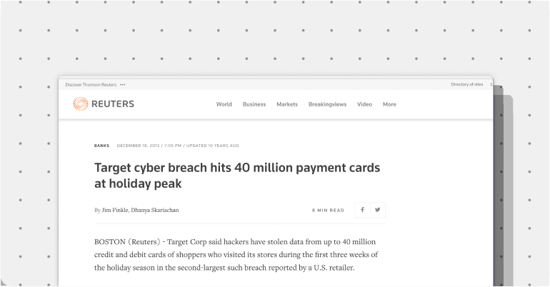
In 2013, Target experienced a security breach where hackers stole over 40 million credit cards. The hackers gained entry into Target’s Point-of-Sale through the AC system, showing that no system was safe. As a response, I worked on a team at Keyno to develop a product that would prevent similar breaches from happening. We had to change how CVV Codes worked while still delivering on a delightful checkout experience.

Goal: Drive adoption of dCVV2 to cut CNP fraud while delivering a smooth, intuitive user experience.
The Investigation
My research uncovered a significant behavioral barrier: consumers perceived their credit cards as static, physical objects. The concept of a changing security code challenged their fundamental mental models about how payment cards functioned. I was tasked with designing an experience that would overcome this resistance while delivering measurable security improvements, placing the user at the center of our design process.
Together, with marketing, we embarked on a comprehensive discovery phase:
- 1,000+ cardholder surveys revealed that 73% of users didn't understand what CVV codes protected against
- Competitive analysis found that existing banking security features had <20% active usage after 30 days
- Conducted 10 in‑person usability tests with both frequent online shoppers and novice users
- In-depth research revealed that most viewed security features as obstacles rather than protection—they wanted security to be automatic, not something they had to manage.
The data pointed to a clear insight: users wouldn't adopt another security app unless it seamlessly integrated into their existing payment behaviors. The app couldn't feel like extra work—it had to feel like enhanced control.
Design Principles
Based on our research, I established these design principles to help:
- Start with the card. The main visual is a digital card front.
- Speed is key. App must load in under 2 seconds.
- Code always present in UI. Explain in context.
- Use benefit‑driven microcopy. The app should enhance, not complicate, the checkout process.
The Design Journey

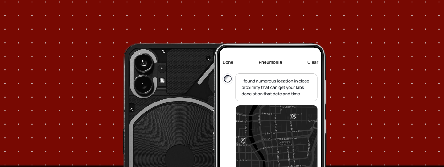
Initial explorations focused on the wrong problem. Early wireframes prominently displayed the CVV code, treating it like a feature to showcase. User testing revealed this created anxiety—users felt like they were managing security rather than making payments. The breakthrough came from reframing the mental model. Instead of showing a "dynamic CVV," I displayed users' familiar cards with one slight difference—the CVV refreshed automatically. By displaying half the physical card alongside the digital CVV, we created a visual bridge between the physical and digital worlds.
Working closely with our CTO Lester, I discovered that our Ionic framework had limitations in performing specific animations. Instead of fighting these constraints, we designed within them, creating a performance-optimized experience that loaded in under 2 seconds even on slower networks, showcasing the adaptability of our design.
The Final Design


Key Design Decision

- Auto-refresh timing: CVV codes update every 5 minutes, balancing security with user convenience (no mid-checkout refreshes)
- Visual feedback: Subtle animations show the CVV changing, building user confidence in the enrollment flow
- Reduced from 7 steps to 3 by leveraging existing bank authentication
Lessons Learned
- Technical fluency accelerates design decisions. Understanding our front-end framework constraints allowed me to propose designs that were both innovative and implementable. When designers understand technical boundaries, they can push creatively within them rather than against them.
- Behavioral change requires bridging mental models. Users don't adopt new behaviors just because they're more secure. By connecting our digital solution to the physical card metaphor, we made the abstract concept of dynamic security tangible and trustworthy.
- Success metrics must align with user value. While our internal metrics focused on adoption, our north star became "fraud prevented per user." This shift from vanity metrics to value metrics guided our iteration priorities.
The Business Impact
Reduction in CNP Fraud
Users
Monthly Churn
Partnership
This project demonstrated that security and usability aren't opposing forces—they're complementary when designed holistically. The 95% fraud reduction didn't come from making the system more complicated to use; it came from making security invisible and automatic.
Industry Recognition

For teams facing similar challenges of changing entrenched user behaviors, the key insight is this: don't try to change the behavior directly. Instead, enhance the existing behavior with your innovation. Users didn't have to learn a new way to pay—they just had to use the app once, and their payments became automatically more secure. The success of Keyno's approach—now protecting millions in transaction volume daily—proves that the best security is the kind users don't have to think about.