Designing the "Office 365" for schools: From District Data to Classroom Chaos.
Cie Digital Labs
January 2023 - April 2023
Project Lead & Lead Product Designer
2 Developers, 1 Junior Designer, and CEO
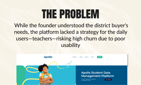
In 2023, I was consulting for Apollo, a new venture founded by Brad, an EdTech veteran who had self-funded his "Second Act" after a $50M exit.
His vision was ambitious: he wanted to build the "Office 365 of Education"—a single, unified operating system that would replace the fragmented mess of tools schools were currently using. He wanted a platform where a Superintendent could manage a budget, a Principal could oversee a school, and a Teacher could run a classroom, all without ever logging out.
I wasn't just designing a feature; I would be designing a coherent operating system that had to serve four distinct personas with competing needs:
I didn't join Apollo as a traditional employee; I came in as a Lead Product Designerthrough Cie, a venture studio and innovation lab. Apollo (the client) had the domain expertise—they knew the education market inside and out. But they needed Cie’s speed and product strategy to translate that expertise into a scalable, modern platform.
My role was to act as the bridge. I wasn't just "freelancing"; I was embedded with their leadership team to drive the product vision. This unique position allowed me to operate with the agility of a startup consultant while wielding the resources and access of an enterprise company. I had the mandate to challenge assumptions, move fast, and push for user-centered designs.
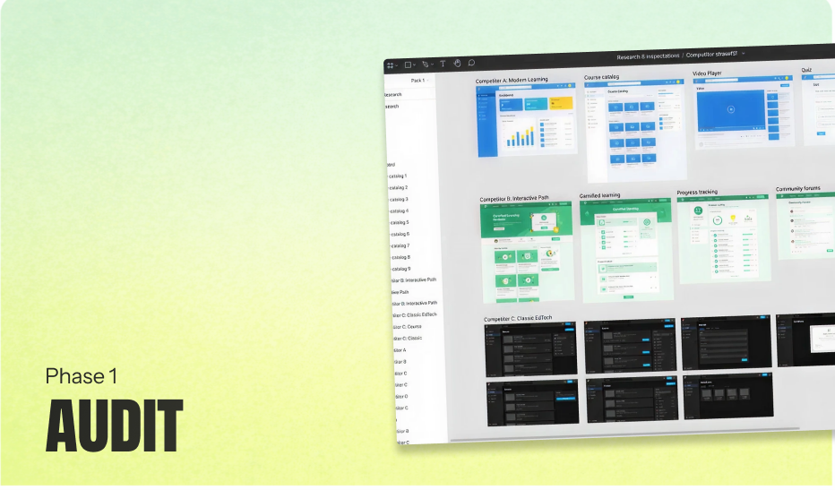
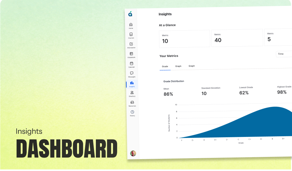
The project started with the District Admin Portal—the heavy, data-driven side of the ecosystem used by Superintendents. I quickly proved I could handle complex data visualization, turning dense district reporting into intuitive dashboards.
Seeing the success on the District side, Brad asked me to take full ownership of the Teacher Portal—the heart of the product. He realized the teacher experience was lagging and trusted me to fix it. He assigned a Junior Designer to support me and effectively gave me the keys to the car, saying, "Run with it."
With full ownership of the Teacher portal, I established a new design rhythm. I leveraged the Junior Designer Brad assigned to me to double our research velocity. I didn't just hand him tickets; I mentored him on user observation. While I handled the high-level architecture and the complex District data integration, I guided him through mapping the granular Teacher workflows.
I led a four-phase design process, treating the Junior Designer not as a production assistant, but as a research partner to double our velocity.
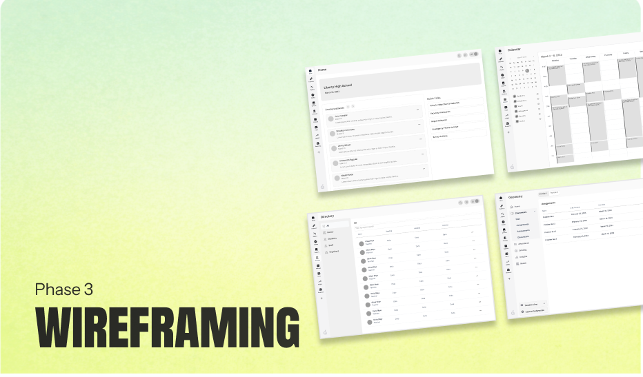
This disciplined approach did more than just organize the chaos of a massive project; it transformed our velocity. By validating our architectural logic in greyscale before committing to a design system, we ensured that when we finally moved to high fidelity, we weren't just guessing at features—we were executing on a verified roadmap, fully prepared to solve the specific, time-pressured realities of the classroom.

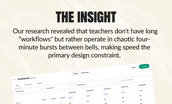
With the "Temporal Journey" as our guide, we knew we had to solve for speed. We focused our energy on the three highest-friction points in a teacher's day: Navigation, Attendance, and Grading.
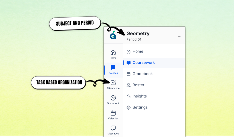
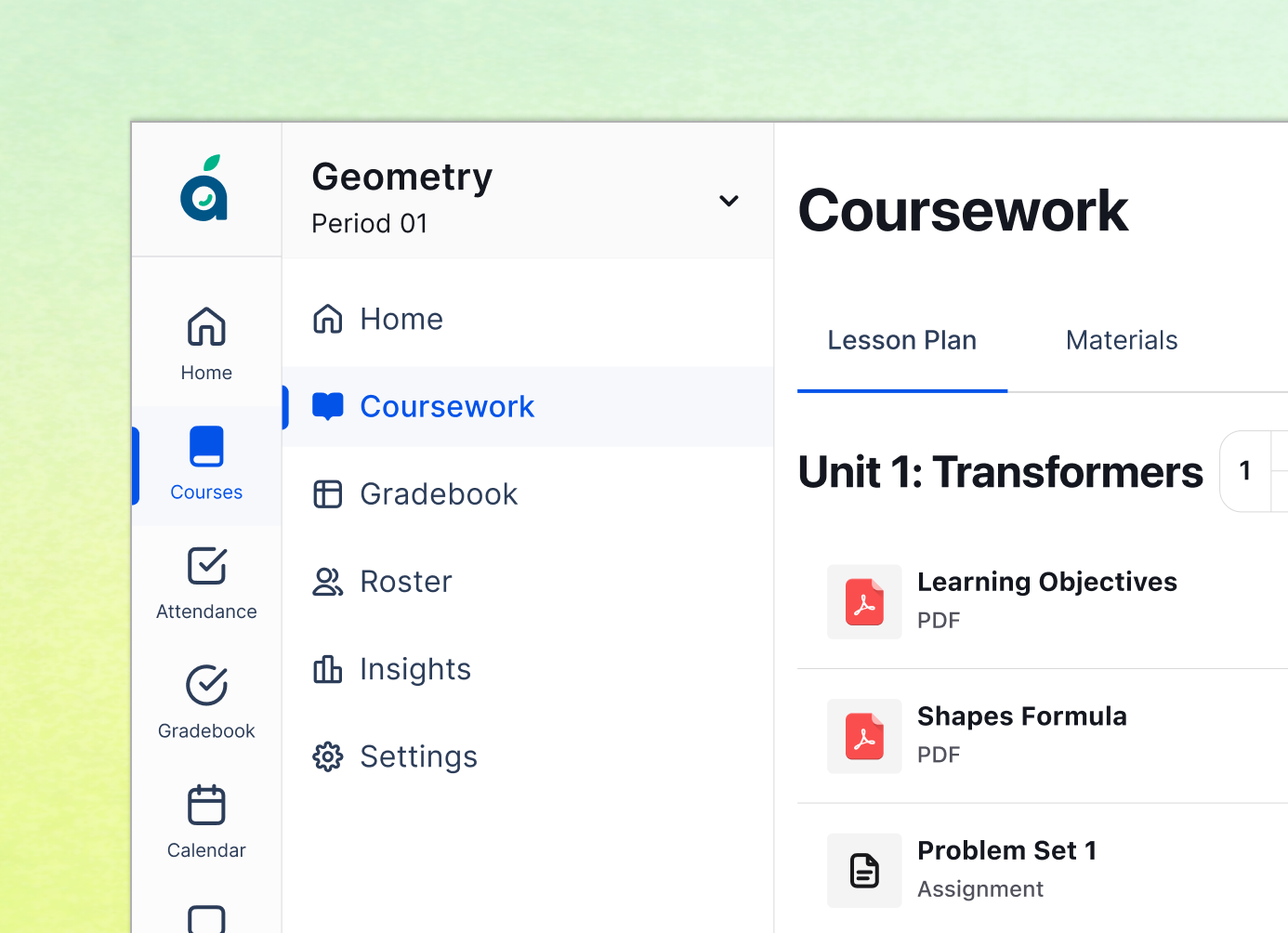
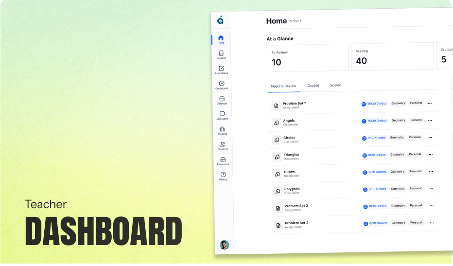
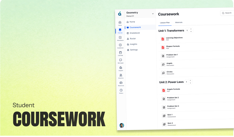
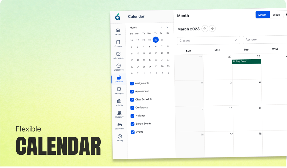
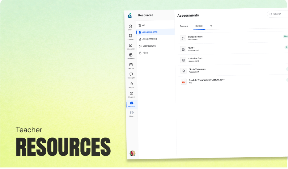
In traditional systems, finding the right class often requires a frustrated dive through static menus. To fix this, I designed a predictive sidebar that anchors directly to the school’s bell schedule. If it’s 9:02 AM, the dashboard automatically highlights "Period 2," and specific badges (like "Attendance Missing") alert the teacher to immediate tasks. This logic meets the teacher exactly where they are, eliminating navigation time during the chaotic transition between classes.
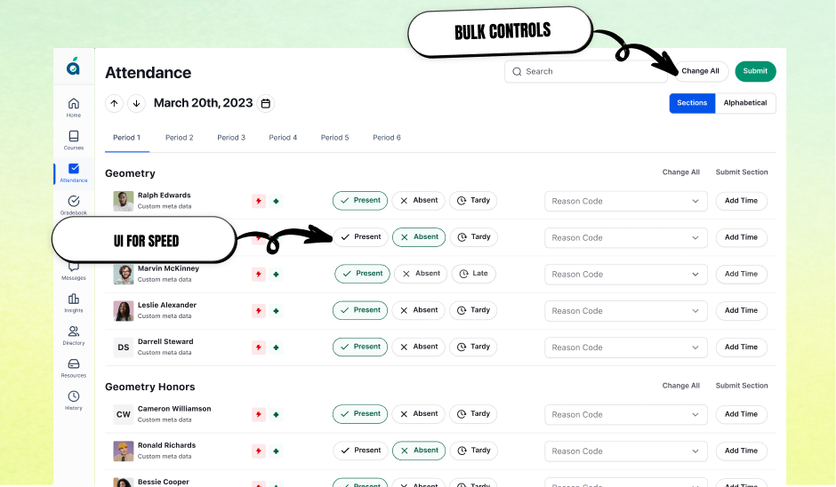
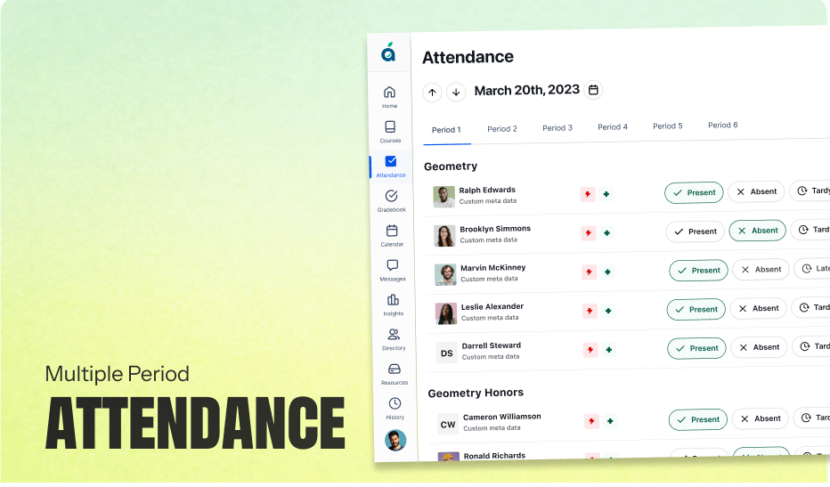
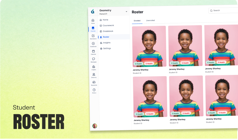
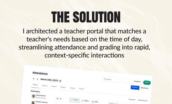
Calling roll is a spatial task, yet most competitors force teachers to scan an alphabetical spreadsheet. I worked with Brad to design a Seating Chart Interface that allows teachers to drag-and-drop desks to mirror their physical room. By aligning the digital interface with the physical reality, marking an absence becomes as simple as tapping an empty desk—transforming a two-minute administrative chore into a ten-second interaction.
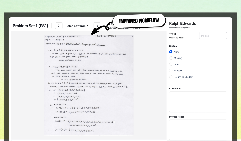
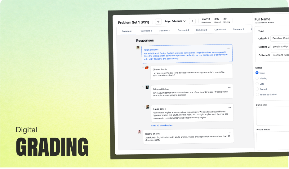
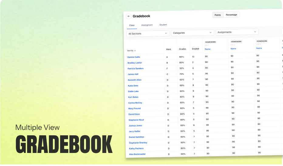
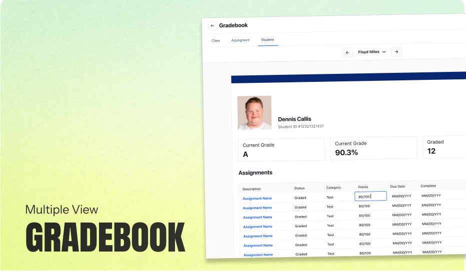
Recognizing that grading styles are deeply personal, I designed a system that adapts to the user. For "power users," I built high-contrast data cells optimized for rapid, Excel-style keyboard entry. For teachers who prefer grading on paper, I introduced a feature that allows them to grade physical worksheets and attach them to the digital record. This hybrid approach centralized data without forcing teachers to abandon their preferred workflows.
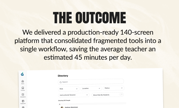
We moved from abstract whiteboard sketches to a fully realized product ecosystem. The final delivery wasn't just a set of pretty screens; it was a production-ready blueprint for the engineering team
We successfully moved the project from abstract whiteboard sketches to a production-ready blueprint. We didn't just hand over a "vision"; we handed over a tactical roadmap that the engineering team could execute on immediately.
The true value of this engagement wasn't a public launch; it was strategic clarity. Before this project, Apollo was a high-level ambition. By the end, it was a defined product with a clear path to market. We successfully translated Brad's $50M vision into a tangible reality, giving him the confidence—and the exact specifications—needed to greenlight development. We estimated that the workflows we defined would eventually save teachers 45 minutes per day, a metric that became the core pitch for the product's future sales team.
Next Case Study
How I designed a 'Safe AI' framework to decode clinical jargon, establishing the UX patterns that now power the organization's internal intelligence engine.
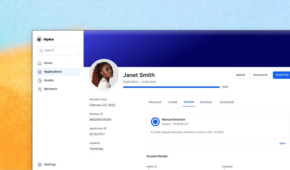
Clearing a 92% backlog by designing a 'Glass Box' AI interface that increased application processing speed by 1200% in just three weeks.
"Designing the first 'Dynamic CVV' experience that bridges the physical and digital worlds, reducing card-not-present fraud by over 95%